In the hustle and bustle of New York City’s subway system, where commuters are typically lost in their thoughts or entranced by the screen in front of them, one man found inspiration that transcended the ordinary. Phil Imbriano, a senior designer at Topps, was making the journey that many New Yorkers know so well. But unlike most, who were likely counting the minutes until their stop, Imbriano’s encounter with a nondescript detail on the train sparked a creative avalanche. This otherwise mundane commute became the genesis of the 2025 Topps Series 1 baseball cards.
The catalyst for this direct line to creativity was a simple badge stationed in the corner of a subway car. Its striking red and silver combo, combined with sleek curves and sharp lines, somehow broke through the usual urban clutter. It was a moment of serendipity—a flash of brilliance amidst the ordinary. With the quick snap of a smartphone camera, a moment was immortalized. By the time Imbriano reached his desk at Topps, he was already fingers deep in pencil sketches, laying the groundwork for what would become the cards’ defining aesthetic.
For Imbriano, inspiration is a capricious muse that can strike anywhere. “I love drawing inspiration from everyday things,” he shared with an enthusiasm that’s palpable. “It could be a building, a sign—just something that catches my eye. I take pictures and refer back to them later. You never know when something simple will turn into something big.” And big it was. What started as a spark in the subway evolved into a full-fledged flame that would light up the world of baseball card collecting.
The 2025 design boasts two bold lines sweeping up the left side and across the card’s top, invoking a sense of movement and imbued with a palette that matches each team’s colors. A burst of aesthetic nostalgia, this design echoes the style of the revered 1982 Topps set. An unintentional homage, this similarity was not planned. Initially, Imbriano found himself drawn to the woodgrain charm of the 1962 and 1987 sets. “The ’82 connection was a happy accident,” he graciously admits. “But I think it works because it blends vintage style with a modern twist.”
The journey from subway inspiration to final product wasn’t a solitary ride. The process of selecting the final design was as intense as the subway’s rush hour. To get to the celebrated outcome, Topps instituted a rigorous in-house competition where designers showcased their concepts, going through multiple review rounds. Imbriano’s design was victorious over 20 contenders, a testament to both its appeal and the competitiveness of Topps’ creative team. Historical elements from prior non-winning designs often reappear in later designs; for example, a distinctive field graphic now marks a player’s position at the lower right, evolving creatively from past attempts.
Throughout this evolutionary process, numerous iterations—ten, to be exact—were considered before landing on the crowning design. Reflecting on the comprehensive effort behind this labor of love, Imbriano confessed, “There’s so much that goes into this process. I don’t think most people realize how much work happens before they ever hold the card in their hands.”
Topps takes a tactile approach. Once digital designs are fleshed out, they are printed in prototype form. This physical rendering is crucial as it simulates the experience collectors will have when opening a pack. Clay Luraschi, Topps’ senior vice president of product, emphasizes the importance of this step. “When we’re down to the final five designs, we actually print them out and simulate opening a pack,” he explains, underscoring how passionate and competitive the design discussion gets within the company.
Every hand on the Topps deck acknowledges the gravity and tradition associated with their work. They carry forward the legacy of Sy Berger’s early designs, crafted at a kitchen table, now evolved into high-tech creativity. Luraschi highlights, “This is the 74th edition of Topps baseball cards… It’s a big deal—but also a lot of fun.”
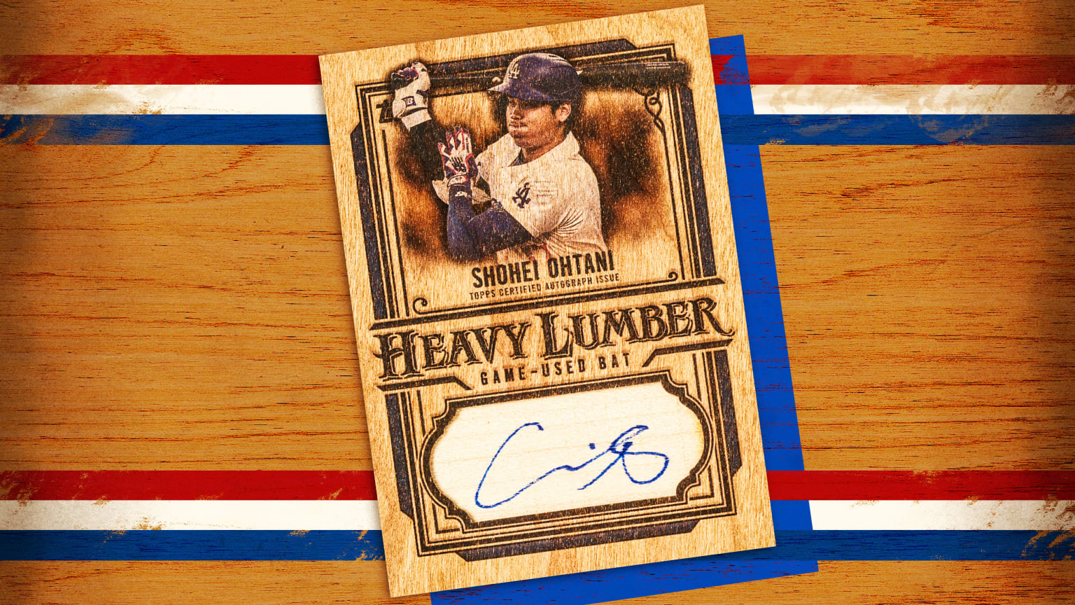
The base design might be the star player, but the Series 1 lineup is brimming with talent in the form of numerous subsets. From Future Stars to Call to the Hall, fans have much to anticipate. Special sets like the City Connect Swatch Collection Autographs, Signature Tunes, and celebratory cards spotlighting the Dodgers’ Freddie Dance supplement this already enticing array. As a nod to Topps’ past, a 35th-anniversary tribute to the 1990 set brings full circle the eye-popping colors and visuals that enthusiasts adore.
Imbriano has imbued the cards with the mindset of creating art that simultaneously stands alone and fits within a larger narrative. He said, “I approach designing cards like I would a movie poster. Each card should stand out on its own, almost like a mini poster in a collector’s hands.” It’s this sort of visionary approach that fuels the artistry behind Topps’ enduring allure.
For collectors years down the road, identifying a card from the 2025 set will bring about instant recognition and a connection to the vibrant tale of its creation. Luraschi sums it up profoundly, “Fifty years from now, people should be able to look at a card and instantly recognize the year it’s from. This one absolutely nails that idea.” An unexpected subway badge has thus sculpted a masterpiece, captured forever in the enduring legacy of Topps.